History
Kpop is a fairly recent music genre, marked by the debut of the group ‘Seo Taiji and boys’ in 1991. There were ballads and trots before this. ‘Seo Taiji and boys’ were the first major group that brought hip-hop and all the elements that we now associate with k-pop groups.
There are various factors with political and social contexts that influenced album design in Korea. The IMF crisis and ‘the Jurassic Park’ effect are some of them, these helped develop the video and music industry helping open the door to global export.
Album designs have hugely been influenced by American and Japanese designs. The 1988 Seoul Olympics allowed distinct African American aesthetics to travel to Korea, and a series of policies and the popularity of ‘Seo Taiji and boys’ increased American culture consumption and brought hip-hop styles into the Korean industry.
In 1998, Korea lifted the ban on Japanese cultural products and this adversely affected the music industry by artists and designers copying the Japanese style.
During this time we can find many album covers that look like replicas of Japanese or American album covers. This shows how Korean album covers went through a process of absorbing material from America and Japan which has slowly led them to create their own aesthetic and style, distinct to kpop. Fuhr explains this as (Fuhr, 2016: p 9): “the West sells, the rest receives. In this sense, the history of Korean popular music in reflecting Korea’s path to modernity is largely a history of reception — be that appropriation, domestication, hybridization, transculturation, or whatever term one likes to adopt.”.
The album cover and packaging industry has changed and in recent years western labels have started taking inspiration from Korean packaging to increase physical sales which have always been high in South Korea even after digitalization. K-pop albums have merchandise in the albums rather than just a CD and this is now also being done by western artists like Taylor Swift’s deluxe album.
Taxonomies
Taxonomy is the science of grouping and classification. It has been used to name and categories all living beings in biology, since 1735 but is now used in various other fields too, like in curating museums.
I’ve decided to display my collection of album cover designs in 3 ways:
1) monochrome
2) type of kpop group (gender)
3) innovative package design
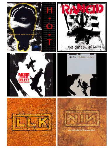
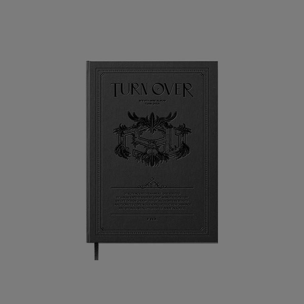
Monochrome
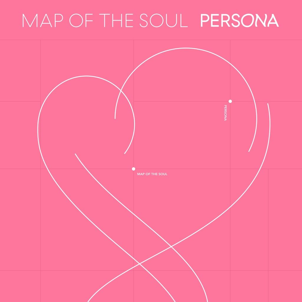
Most k-pop albums are bold and colourful but some of the best ones are monochrome and convey the theme of the album with just one colour( and black and white).


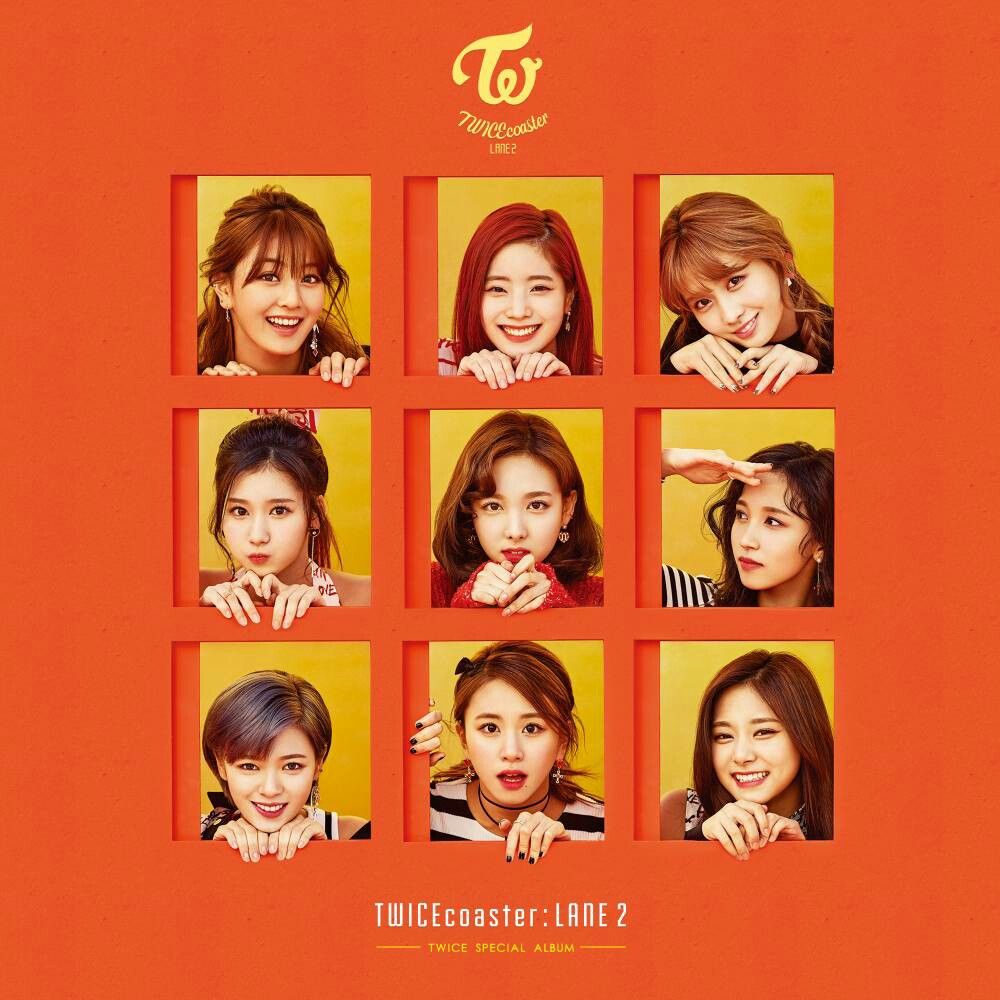
Type of kpop group
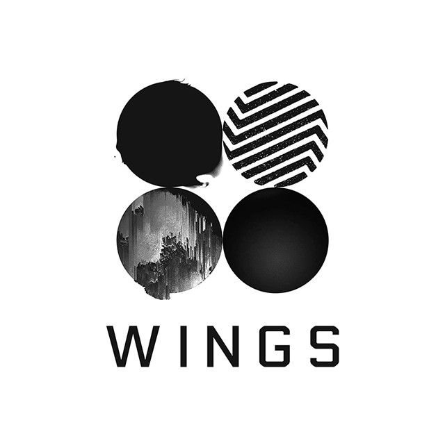
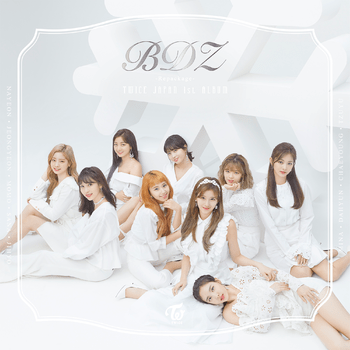
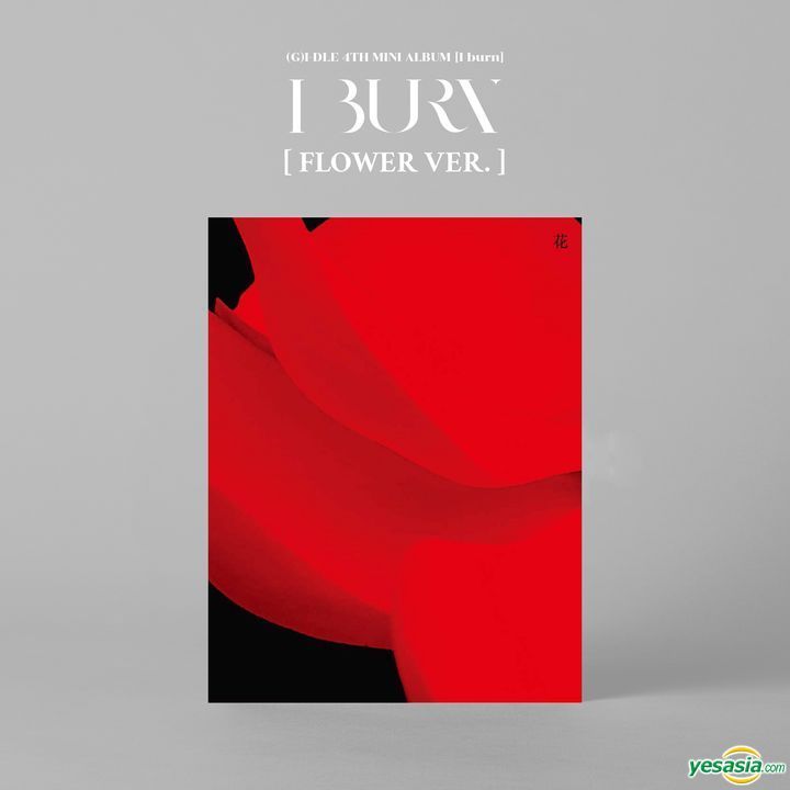
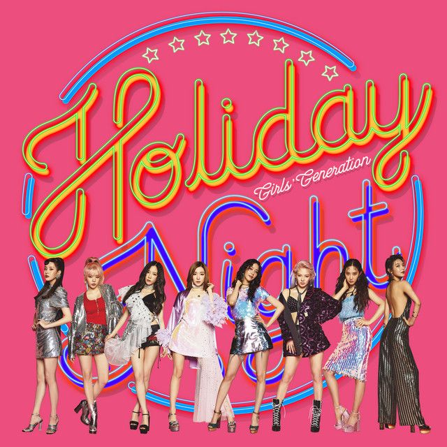
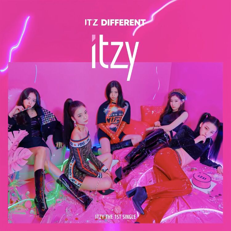
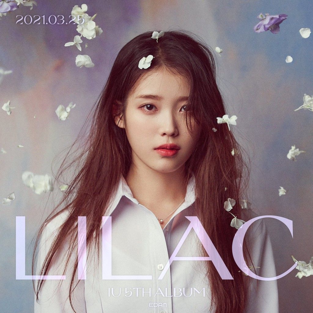
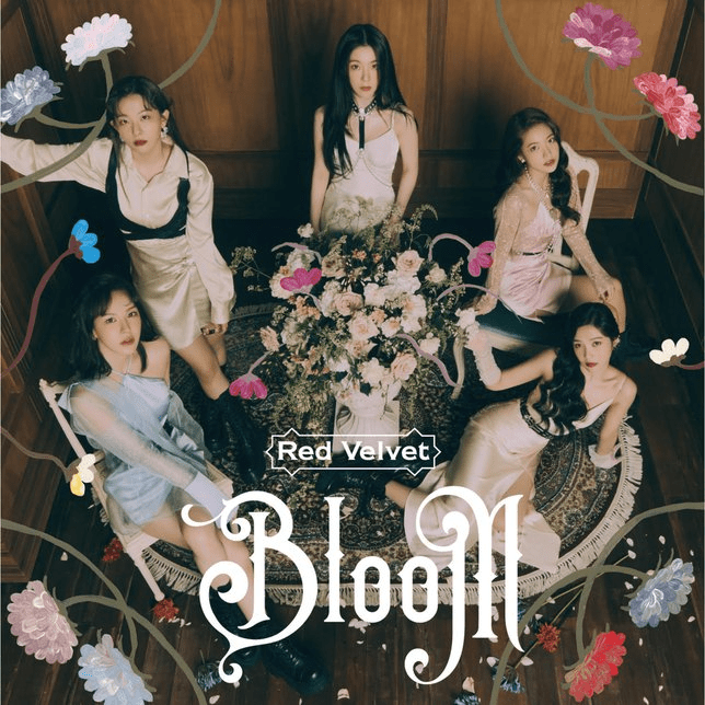
After researching album cover designs and their marketing I’ve noticed that there are two main routes a designer takes, they either have celebrities (the kpop idols) on the album or a symbol/illustration. Many labels use the faces of their artists for marketing and I wanted to compare how the ratio varies between female and male artists.

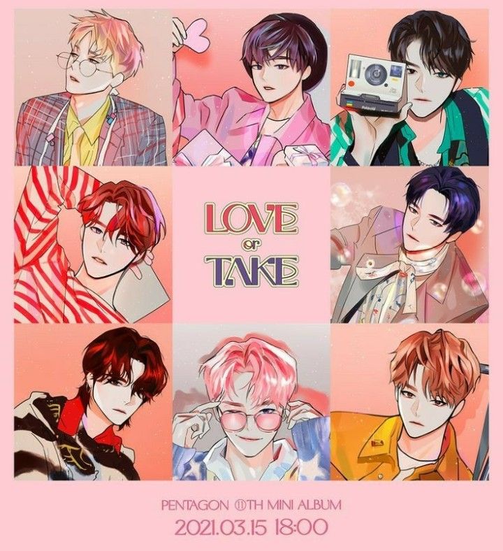


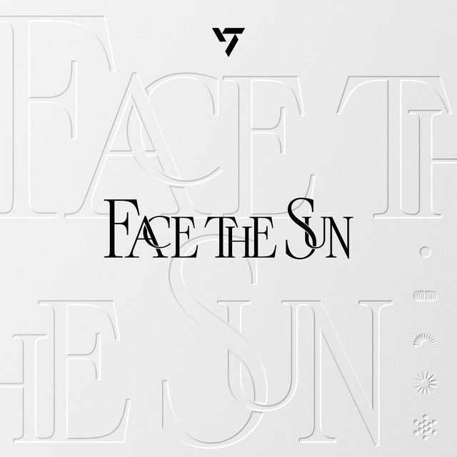
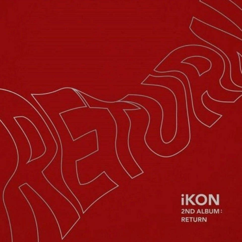
While it hugely depends on the label and k-pop group, I have noticed that most of the album covers for female k-pop idols have their faces. This does not mean that the vice versa doesn’t happen, example ace and seventeen are some male groups that have photography based album covers with a group photo while le serrafim and mamamoo are female groups that have symbols on their covers.


I think the choice of cover design depends on various factors like the label’s trust in the album (if they think the artist won’t sell unless they market their face on the album) but it might just be that it’s an artistic choice based on the concept of the album songs or that the group has always done people on album covers and would like to keep that image in the industry because their audience (the fans) are used to it and love it.
I also think this is done more in female groups to increase physical sales as male groups always have considerably higher physical sales due to their stable fan bases. I would like to research further on this and find reasons.
Hybrid Packaging
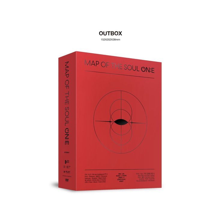
There are various types of packaging styles done with kpop albums like cd cases, jewel cases, book albums, sleeved albums, box albums, hybrid albums, etc. Even within these styles packaging is played around with in the industry to keep it fun and interesting.
Hybrid packaging is when you can’t put the packaging style in one category because it has many incorporated into one or is just very different from any category. This packaging style in my opinion allows the most experimentation and creativity.
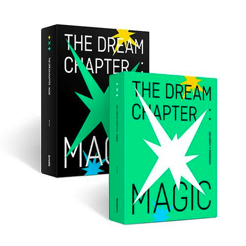
TXT is a group that releases most of its albums in hybrid packaging. The packaging always has a reason and ties in with the graphic design of the cover itself. Their ‘The Dream Chapter’ trilogy all have different packaging designs based on the concept.
‘Star’ has a plus-shaped star with the top part printed on the see-through plastic sleeve that gets removed. The sleeve also has a holographic finish which when moved around in light reflects rainbows and this ties in with the starry magical concept.

The packaging for ‘Magic’ was designed to give the feel of an actual magic box, it has various aspects that you might find in an actual magician’s box.
‘Eternity’, the last in the trilogy, has a concept of magic spells, curses, and enchantments and this is translated in the packaging very nicely. The album is a book with a lock on it, and the front has a frosty finish and glow in the dark elements in some parts giving a mystical feel to it. Even the colours chosen remind us of magic.

The best thing about the entire concept of this series is also that the three, while being so distinct, still tie in together, with a main symbol on the front and having the same height which is appealing to the buyer as it looks good displayed.
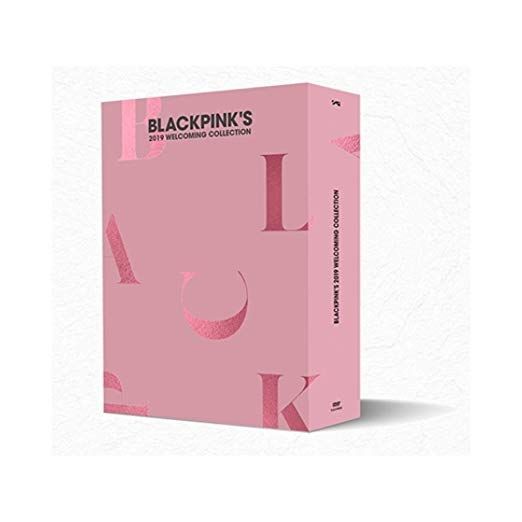
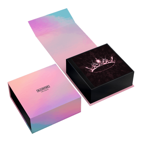
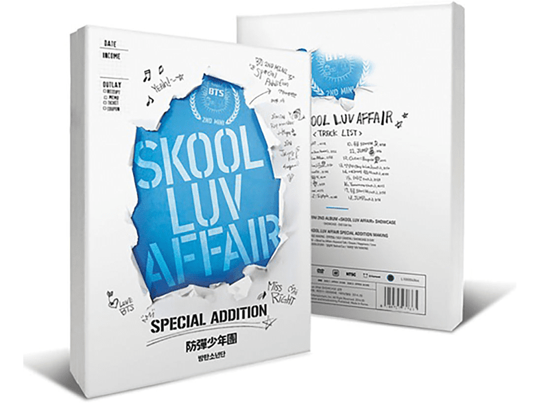
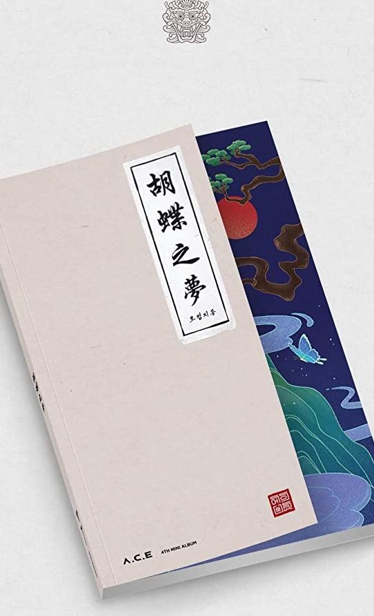
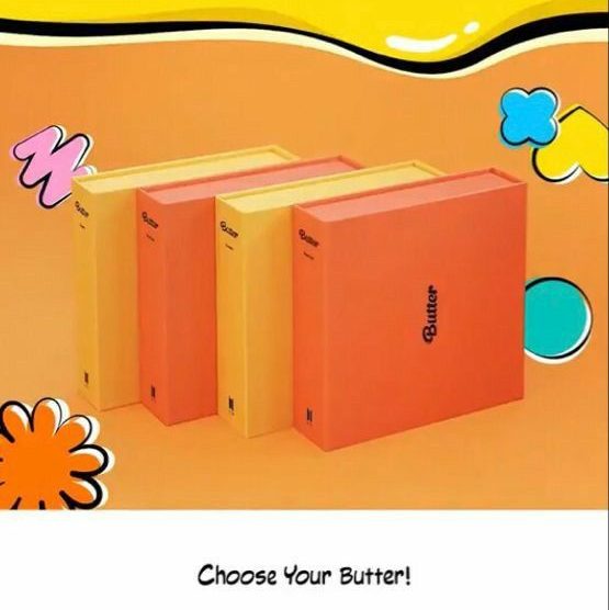
There are various other albums with hybrid packagings like BTS’s Butter (a DIY album with a minimalist design that allows the customer to design it however they want) and Skool Luv Affair special edition, ACE’s the butterfly fantasy, Blackpink’s The Album (made to look and feel like a jewel box) etc.

Leave a comment